WOW!house 2026: The colours, materials and themes we loved
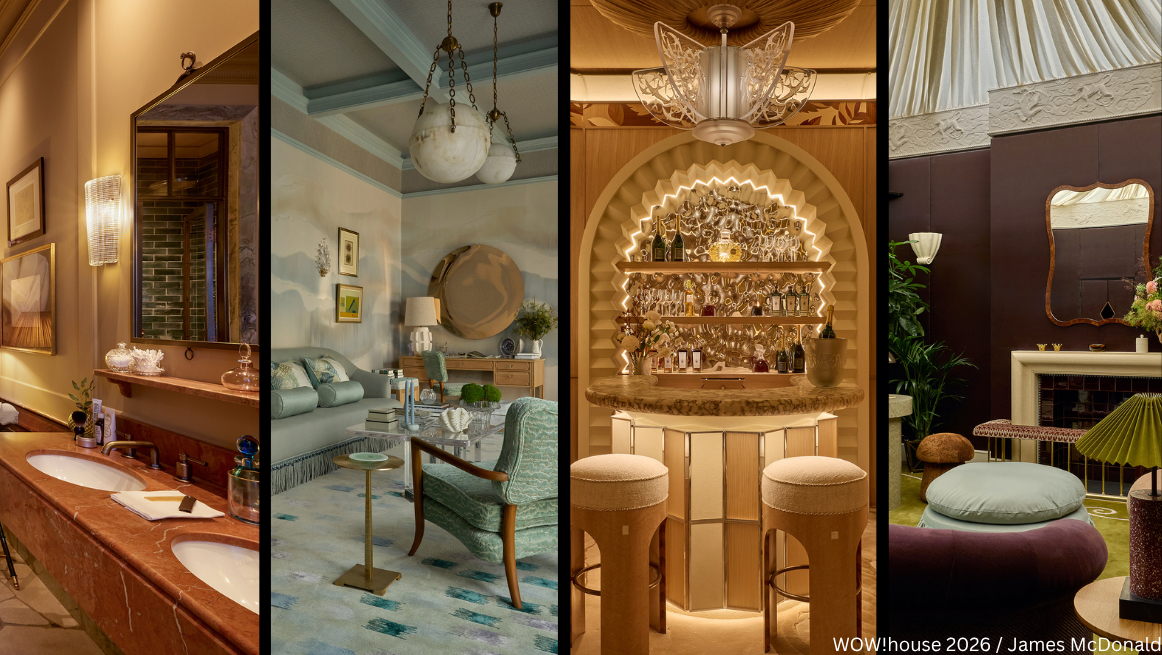
Every June, the design world turns its attention to WOW!house at Design Centre Chelsea Harbour. Showcasing the work of some of the industry’s most talented designers and brands, it’s one of the highlights of the interiors calendar for the Roundhouse team.
While we’re not in the business of slavishly chasing trends, we’re endlessly curious about how colours, materials and craftsmanship are evolving. And in an industry increasingly viewed through screens, there’s something invaluable about experiencing design in person. Seeing how light moves across a hand-finished surface, how colours shift from room to room, or how materials combine to create a particular mood simply can’t be replicated online.
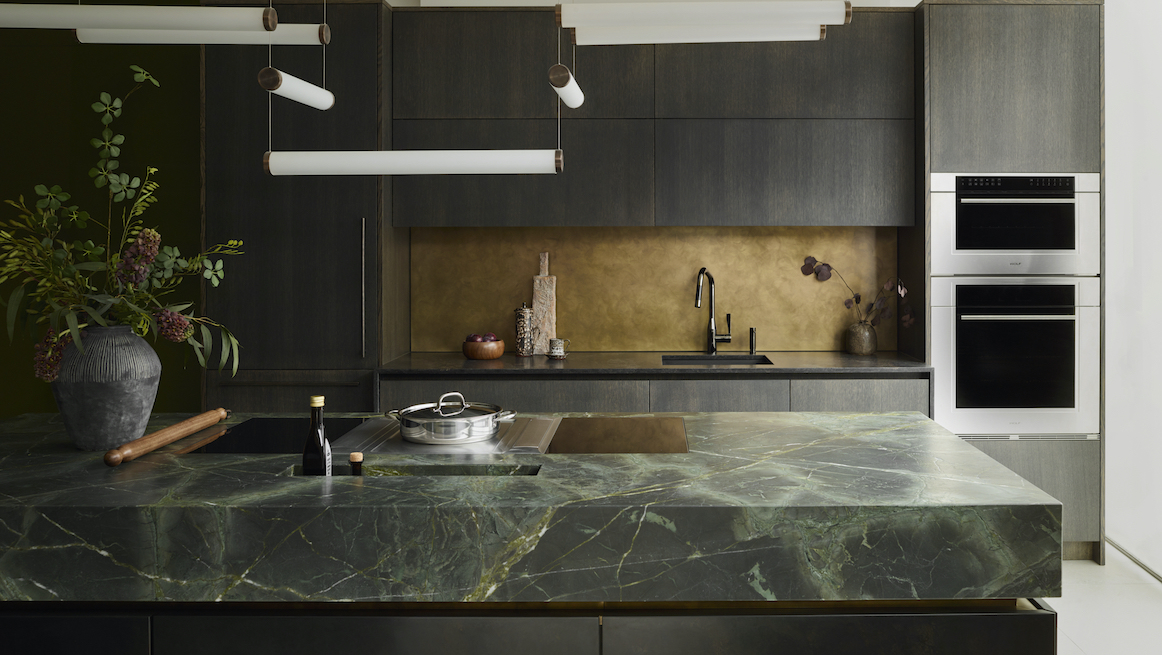
WOW!house offers the perfect opportunity to step away from our showrooms and immerse ourselves in creativity, and this year’s edition felt particularly rich and optimistic. Warmth was everywhere, from rich timbers and earthy reds to chalky blues, tactile stone and hand-finished surfaces, creating interiors that felt layered, welcoming and full of character. As we explored the 22 rooms and outdoor spaces, several themes emerged that felt especially relevant to Roundhouse and how we work. Discover the colours and materials that caught our attention, and the Roundhouse projects that echo their enduring appeal.
Sky blue brings a breath of fresh air
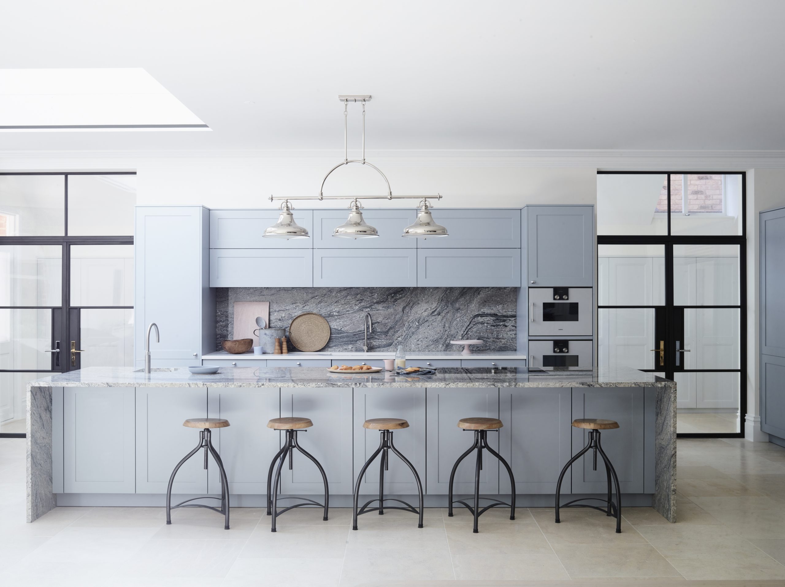
One of the most refreshing palettes at WOW!house came from Sara Cosgrove’s Phillip Jeffries Morning Room, where soft sky blues create an atmosphere that feels uplifting, elegant and almost dream-like.
Blue can sometimes feel formal or nautical, but this lighter, chalkier interpretation felt remarkably versatile. Used thoughtfully, it brings calm and freshness without overwhelming a space and pairs effortlessly with natural materials such as oak and pale limestone. Metallic-wise, soft sky blues with cool undertones tend to work best with crisp finishes like polished nickel and chrome.
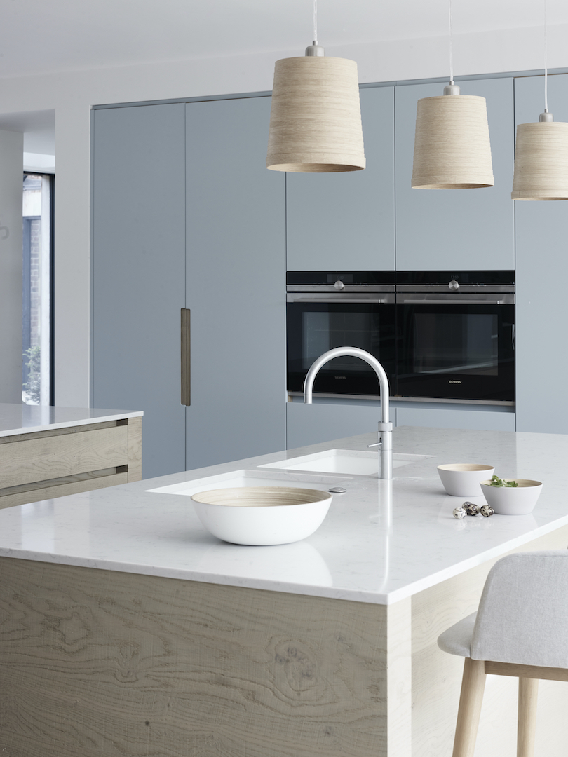
A similar approach can be seen in our Grean or Navarro project, where cabinetry painted in Farrow & Ball’s Parma Gray – a cool mid-blue – is balanced with warm timber and natural stone. The effect is calm and contemporary, bringing colour into the kitchen in a relaxed, timeless way.
Pistachio green feels fresh yet timeless
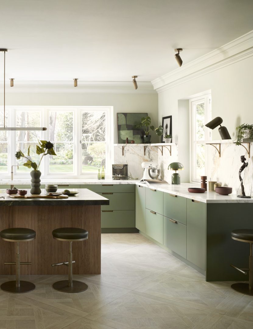
Alongside the soft blues that appeared throughout WOW!house, pistachio and sage greens emerged as another defining colour story. Samantha Bartlett’s Martin Moore Kitchen captured the mood beautifully, using muted green tones to create a space that felt calm, grounded and deeply connected to nature.
What makes these softer greens so appealing is their versatility. Fresh and uplifting, they pair effortlessly with natural materials such as timber, stone and brass. As homeowners increasingly seek interiors that promote wellbeing and longevity, it’s easy to see why these nature-inspired hues continue to resonate.
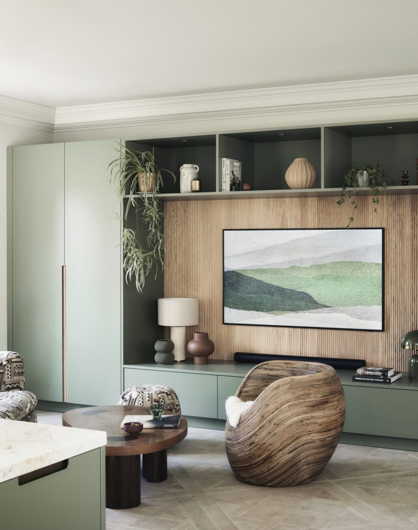
A similar approach can be seen in our Kinsey project, where cabinetry painted in Little Greene’s Sage is paired with fluted oak detailing, Verde Fantastico stone and honed Calacatta Monet marble. The combination feels layered, tactile and timeless, demonstrating how green can bring character and warmth while allowing beautiful materials and craftsmanship to take centre stage.
Burgundy takes centre stage
If there is one colour appearing on repeat at WOW!house 2026, it’s burgundy. Romo’s Speakeasy Salon by Studio Duggan showcases the colour beautifully, demonstrating how these deeper wine-inspired tones can feel sophisticated rather than overpowering. Rich reds, aubergines and oxblood shades feature throughout the showhouse, often paired with timber, bronze and textured fabrics.
What makes burgundy so appealing is its versatility. It brings depth and drama, yet still feels warm and inviting. In our Brown Project, burgundy-led seating provides a striking contrast to dark cabinetry and richly veined stone, demonstrating how these wine-inspired tones can inject personality without dominating a space. Whether introduced through upholstery, artwork or cabinetry accents, burgundy can anchor an entire scheme. More importantly, it reflects a broader move towards interiors that feel cocooning and cosy, which we are always pleased to see.
Orange, rust and sun-baked warmth
Another standout colour story comes from the Ca’ Pietra Bathroom by De Rosee Sa, where terracotta, rust and burnt orange tones deliver a distinctly Mediterranean mood.
These earthy shades bring an instant sense of warmth and authenticity. They connect beautifully with natural stone, plaster finishes and timber, helping interiors feel relaxed and lived-in rather than overly polished.
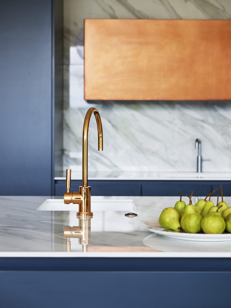
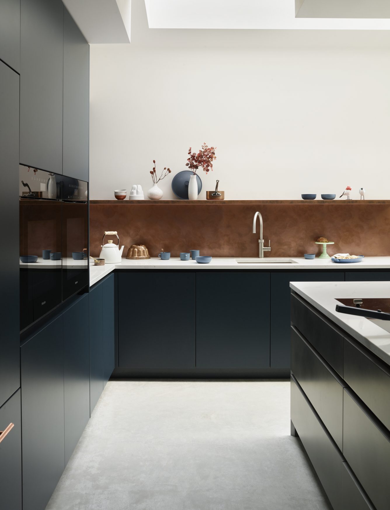
A similar warmth can be found in our Fawnbrake or Stephens project, where our patinated metallic feature doors in matt sanded copper introduce a rich burnt-orange tone that shifts beautifully throughout the day. Set against deep blue cabinetry, marble surfaces and polished copper details, this unique Roundhouse finish demonstrates how these warmer hues can feel sophisticated and architectural.
Timber in all its glory
Perhaps the most striking material story throughout WOW!house is the celebration of timber. The Lalique Home Bar by Elicyon and Róisín Lafferty’s Shepel’ Library both showcase the extraordinary warmth and character that beautifully crafted wood and exotic grains can bring to a room. Across the showhouse, timber is used not simply as a supporting material but as a defining design feature.
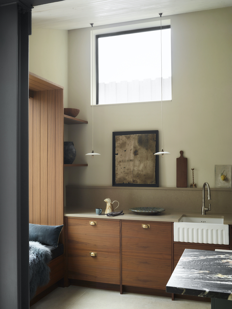
This growing appreciation for natural wood is something we love seeing. In our Moony project, richly grained walnut introduces depth and sophistication while helping the kitchen feel completely grounded within its period setting. Meanwhile, our Bulpitt project demonstrates how oak can be used more extensively, in vertical and fluted formats that really celebrate the natural grain patterns. Whether light or dark, highly figured or rough sawn, timber has a unique ability to make contemporary interiors feel instantly more welcoming.
Craftsmanship over perfection
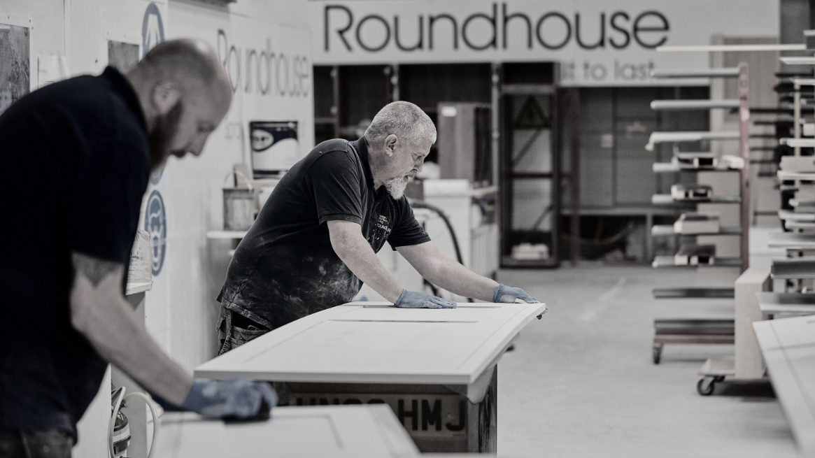
More than any single colour or material, the overriding message from WOW!house 2026 is a renewed appreciation for craftsmanship. Hand-finished surfaces, fluted details, beautifully figured stone, bespoke joinery and artisanal materials appear throughout the showhouse. It’s a direction that feels particularly relevant to our core values as British bespoke makers, as well as society in general today. As homeowners increasingly seek longevity over novelty, there is growing value in spaces that feel personal, tactile and are built to last.
Discover more highlights from WOW!house 2026 on our Instagram roundup and tell us which colours, materials and design trends caught your eye. For more inspiration, explore Roundhouse’s latest projects or book an online appointment to discover how these ideas can be brought to life in your own home.
Frequently Asked Questions:
The latest interior trends
The strongest colour stories in luxury interiors right now are warmer and more layered than in previous years. Burgundy, terracotta, rust, chalky blues, soft greens and warm neutrals are all proving popular, often paired with natural materials such as timber and stone. Rather than making bold statements, these colours are being used to create depth, warmth and personality.
Timber remains one of the most enduring materials in kitchen design. Whether it’s pale oak, richly grained walnut or stained veneers, wood brings warmth, character and longevity to a space. Natural stone, particularly quartzite and marble-inspired surfaces, also continues to stand the test of time thanks to its beauty and durability.
The easiest approach is to introduce colour through feature elements rather than every surface. Consider painted cabinetry, upholstered seating, statement lighting, artwork or decorative accessories. Balancing colour with natural materials such as timber, stone and metal help create a scheme that feels considered rather than overpowering.
Many designers are moving away from cooler greys in favour of warmer neutrals such as alabaster, chalk, biscuit and soft stone tones. These shades create a more welcoming atmosphere and work beautifully alongside natural materials, making them particularly well suited to contemporary kitchens and open-plan living spaces.
Luxury is increasingly defined by quality, craftsmanship and thoughtful design rather than expensive finishes alone. Carefully chosen materials, bespoke details, beautifully integrated storage and a palette that feels cohesive and personal all contribute to a kitchen that feels both elegant and enduring.