How to choose the right kitchen cabinet colours for your home
Few decisions have the power to change the character of a kitchen quite like cabinet colour. Cabinetry occupies a large proportion of the room’s visual field, so its colour affects everything from the apparent scale of the space to how worktops, flooring and hardware are perceived. It can make a room feel brighter, richer, calmer, warmer and completely transform the atmosphere.
Some lucky souls have an instinctive feel for colour and know exactly which shades they’ll happily live with for years. For everyone else, choosing the right cabinet colour is a tad more challenging. However, the aim is the same: to arrive at a palette you feel genuinely committed to and will never regret. For Roundhouse designers, reaching that point is a little about instinct and training but mostly a process of elimination: assessing the architecture, understanding the light, identifying undertones and building a palette in which every finish earns its place. Here is how we navigate the process of choosing cabinet colour.
Start with the room, not the paint charts
Before thinking about individual shades, it’s always worth considering the character of your house and the atmosphere you want to create in the kitchen. An urban apartment, a period townhouse and a country home will each give colour a different context. Also decide whether you want the room to feel warm and intimate, fresh and uplifting, or somewhere between the two.
Next try to picture how you will use the space. A kitchen mainly enjoyed over breakfast or in morning light may call for a different palette from one that comes into its own after work or when entertaining at weekends. Imagining yourself in the finished kitchen can be surprisingly useful when narrowing down how you feel about certain colours. Many colour experts recommend looking in your wardrobe for colour inspiration, it’s often a good indicator of which colours you are frequently drawn too – even if that’s just pale colours versus dark.
Then you can start consulting paint charts, colour trends and begin to identify which colour families most appeal, and which ones leave you cold. Take stock of the elements that are harder to change – flooring, architectural materials, stone and the room’s orientation – and remember that kitchen cupboard paint is only one part of the equation. Timber stains, metallic finishes, splashbacks and worktops all contribute colour of their own.
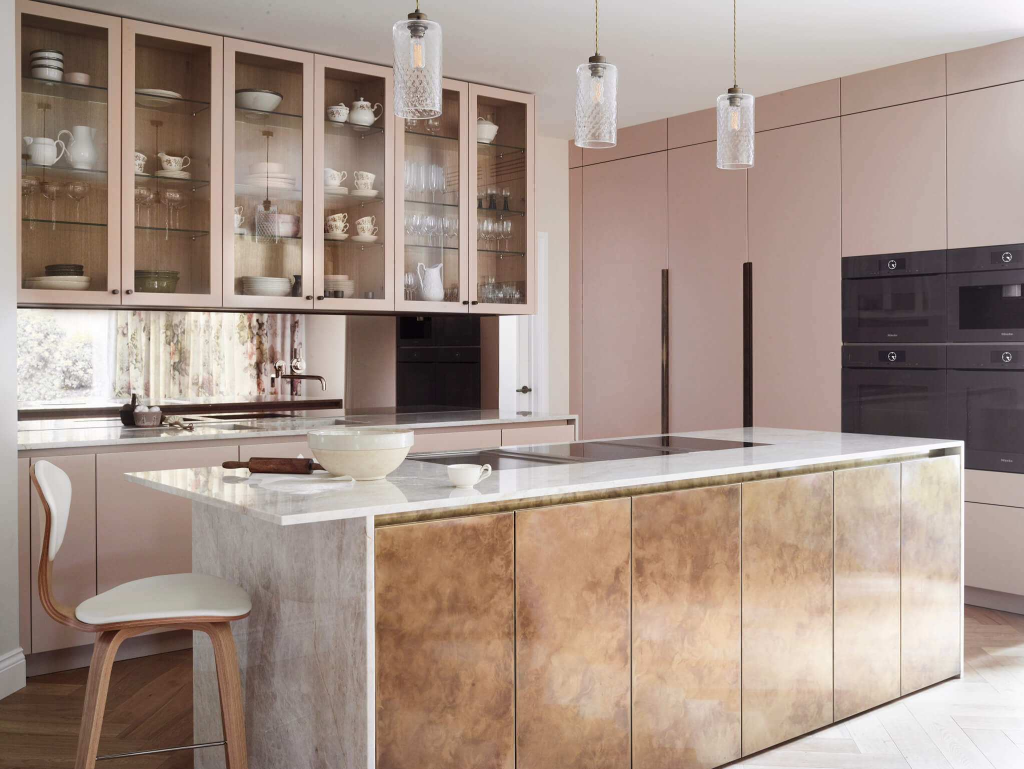
Our Brand kitchen is a good example of how colour can set the mood. Farrow & Ball’s Setting Plaster gives the cabinetry a warm, muted pink cast that immediately makes the room feel more inviting and intimate, while the antique brass island and bronze-tinted mirror deepen that sense of warmth. Together, they create a palette that feels classic and cosy without becoming overly traditional, nor saccharine sweet.
See colour in the right light
It’s so important to recognise that light can completely alter how a colour reads, which is why a shade you love in a friend’s kitchen, online, or even a different room in your own home, can look very different in your kitchen. In general terms, north-facing rooms receive cooler, more diffuse daylight, which can emphasise blue or grey undertones, while strong south-facing light generally brings out warmer notes and can make saturated colours appear more intense. East- and west-facing rooms can change character dramatically over the course of a day.
But the position and size of windows can also impact colour tone, so we always recommend viewing generous colour samples in the kitchen itself, on different walls and at the times you are most likely to use the room. Artificial lighting should be considered at the same stage. LED colour temperature can be specified – or, with some fittings, adjusted – so a warmer 2700K light will give cabinetry a very different character from a crisper 3000K or 4000K source. The aim is not to use lighting to ‘correct’ a colour, but to make sure the two have been designed to work together.
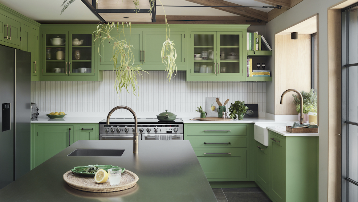
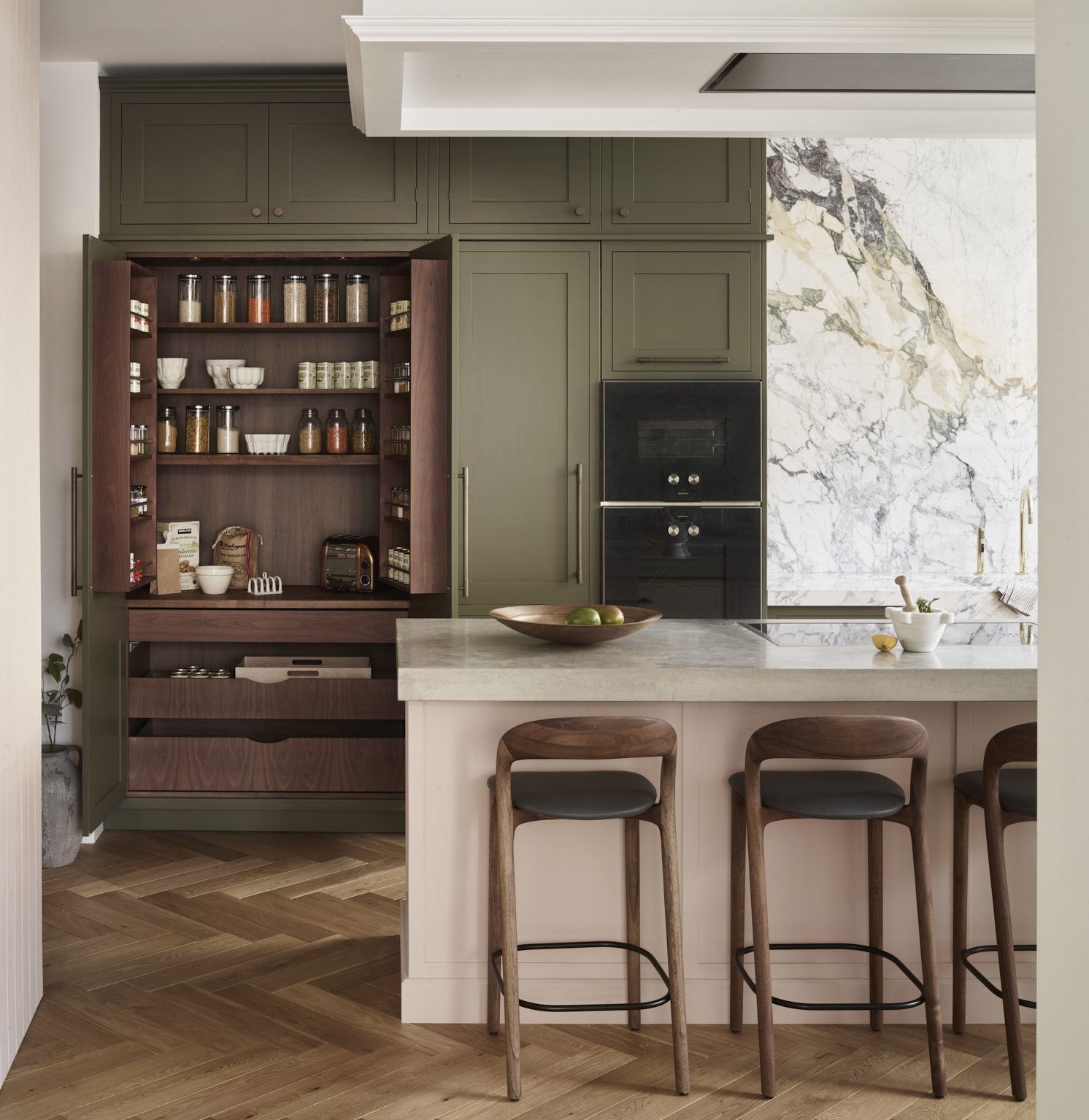
Our Oliver kitchen (pictured at the top of this page) shows how a lively cabinet colour can remain fresh rather than overpowering. Sanderson’s Botanical Green is balanced by white Kit Kat tiles and stainless-steel worktops, both of which reflect light back into the room. The effect is an uplifting green that retains its clarity as the light changes, rather than becoming visually dense or muddy.
Don’t underestimate undertones
Two colours can look compatible on separate samples and distinctly wrong once installed together. The culprit is often undertone: the trace of blue, yellow, red or grey beneath the dominant colour. This matters especially when kitchen cabinets meet natural stone, where several hues may be present in a single slab.
Luckily, you don’t need professional design training to get it right. Paint companies often group shades into colour families, which is a useful starting point for finding tones that sit comfortably together, while Roundhouse’s design team will help you identify colours and finishes that will work with the materials already in the scheme. Once you have a shortlist, place large painted samples directly beside your worktop samples, flooring and any other fixed finishes, and look at them at different times of day. It’s much easier to spot colour incompatibility when everything is viewed together.
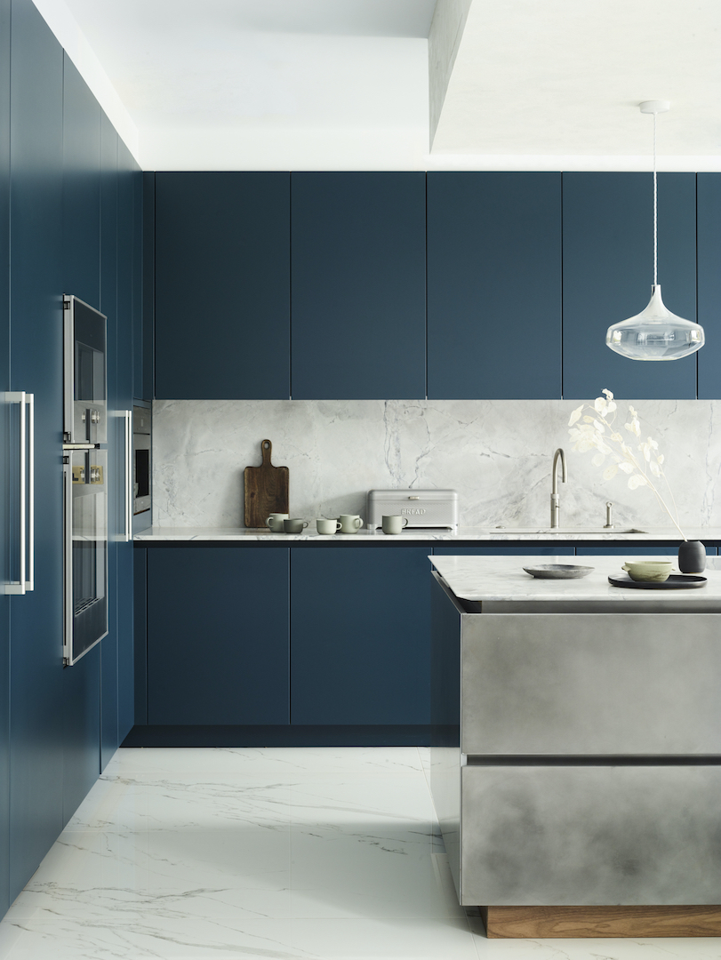
In our Tandon project, Farrow & Ball’s Hague Blue, which has rich green and grey undertones, runs across the main cabinetry. Those underlying tones help explain why it works so comfortably with the cooler, patinated silver finish on the island, rather than feeling like two unrelated colours competing for attention.
Learn the art of dark cabinets
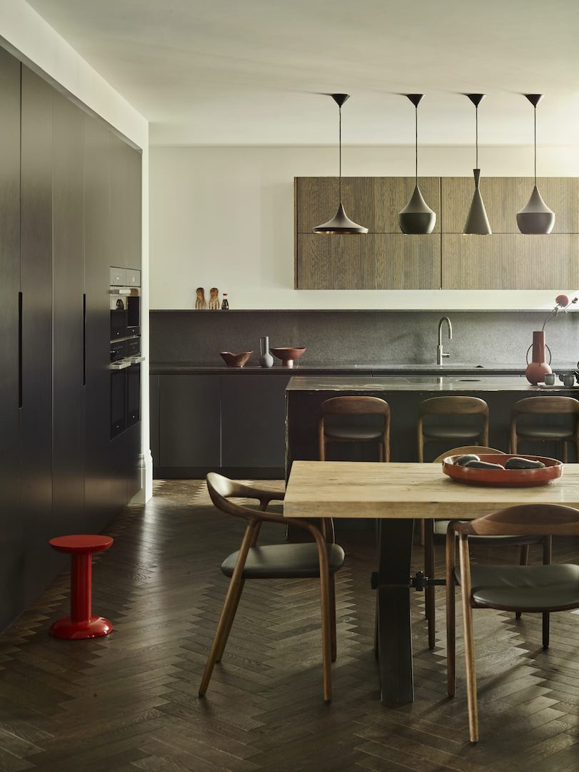
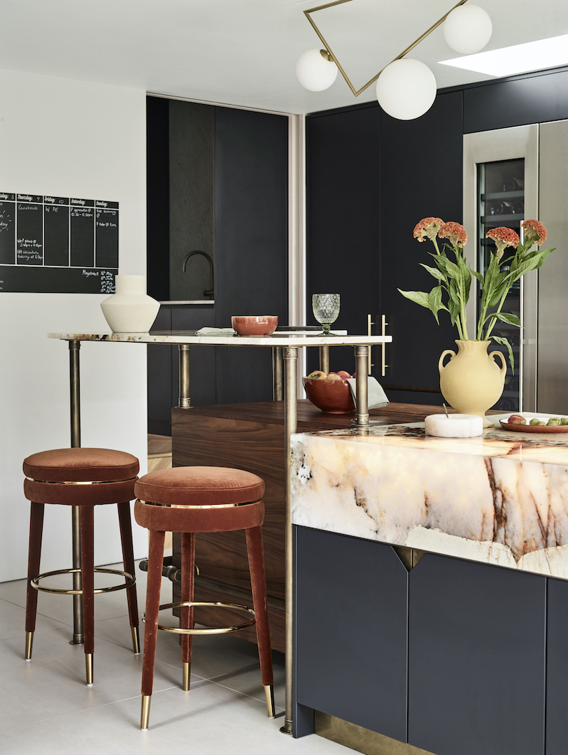
Many people feel less confident choosing dark cabinetry, but going darker doesn’t have to mean diving straight into an all-black kitchen. There are plenty of ways to introduce deeper colour while staying well within your decorating comfort zone. When choosing dark cabinet colours, what matters is how it is distributed and, crucially, what you put around it. Deep colours tend to work best when there is enough contrast to define the cabinetry rather than allowing it to merge into one solid block. Pale walls and flooring, generous natural light and lighter worktops can all create visual breathing space, while warm timber and metallic finishes prevent a darker scheme from feeling austere. In luxury kitchens, this careful balance can make black and near-black cabinetry feel much more inviting than you’d imagine. There is also a case for going all-in on dark colours and finishes, but you need to really embrace the mood. Layering in plenty of texture, variation in sheen and strong sculptural shapes will stop the scheme feeling flat or half-hearted.
For those ready to fully embrace a dark-on-dark scheme, our Raine project combines matt Off-Black cabinetry with Nero Assoluto Antique worktops and an African Fusion quartzite island, creating a rich, sophisticated kitchen with depth and drama. Whereas, in our Avenue project, Farrow & Ball’s Pitch Black provides a strong, neutral backdrop to the exotic Patagonia Natural Quartzite, whose pale surface and warm, translucent veining immediately lift the darker cabinetry. Walnut adds another layer of warmth, while antique brass is repeated across the handles, plinth, lighting and bar stools. Rather than relying on the cabinetry colour alone to make an impact, the scheme uses contrast, material and repetition to give the dark palette depth and definition.
Build a layered palette
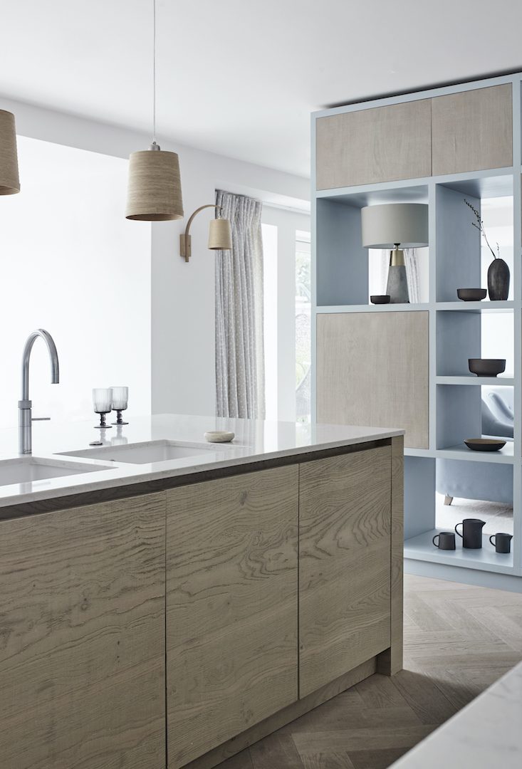
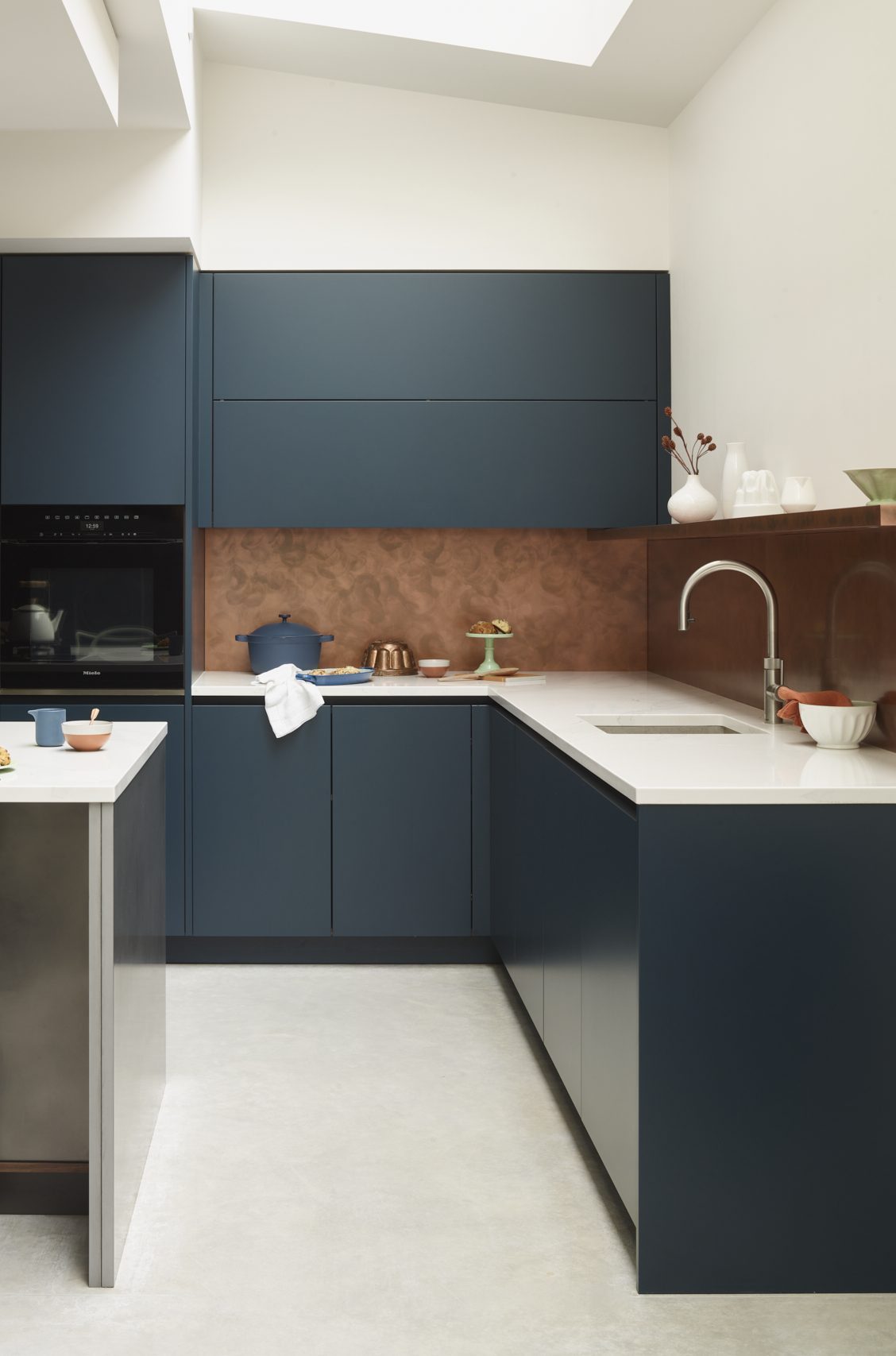
A sophisticated scheme rarely depends on one colour repeated everywhere. Layering two or more colours (whether different or tones of one shade) creates depth, but it can also help organise the kitchen visually, distinguishing an island from perimeter cabinetry or creating a more relaxed, freestanding look. Bespoke kitchens offer greater freedom here, with custom colours available in almost any shade imaginable not just a limited palette.
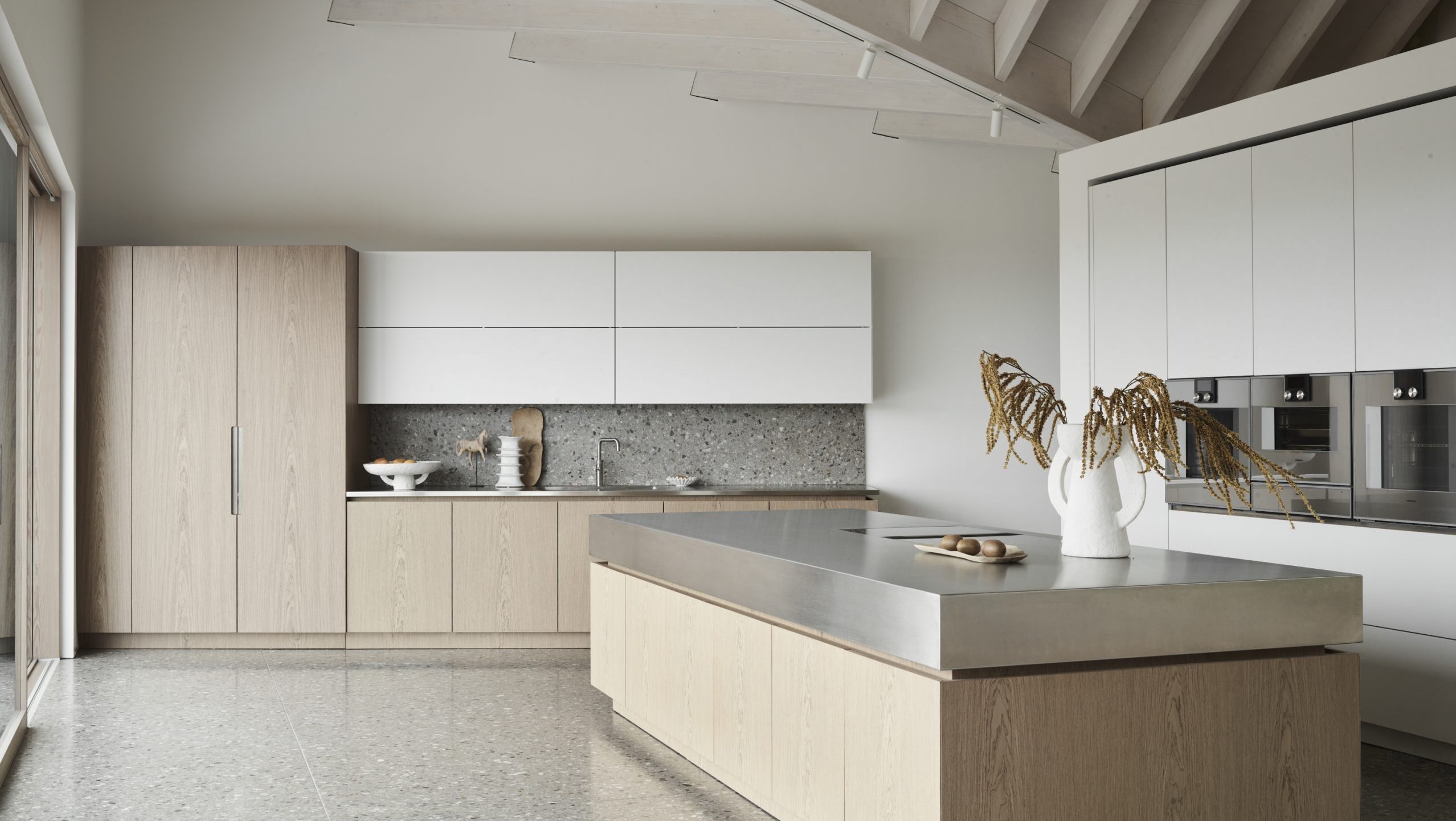
A simple way to layer colour is to use the 60-30-10 rule: let one colour or finish dominate roughly 60% of the scheme, use a second across around 30%, then reserve the final 10% for an accent. You don’t need to calculate it precisely; the point is to establish a clear hierarchy. Painted cabinetry might provide the main colour, for example, with timber on the island and brass or another metal used sparingly on handles and lighting. Treat natural wood as a colour in its own right and the whole palette becomes much easier to balance.
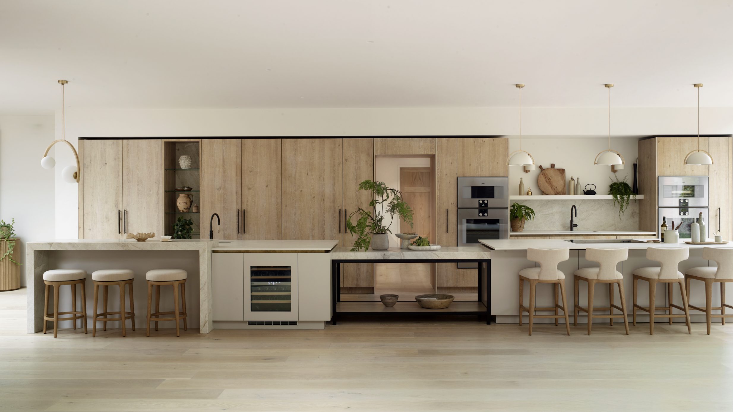
Our Navarro project combines pale blue cabinetry with stained rough-sawn oak veneer, allowing the timber to act almost as a second colour. The blue defines the open shelving and room-dividing cabinetry (and features on the tall cabinetry behind the island), while oak brings texture and warmth to the heart of the kitchen. In contrast, our Fawnbrake project layers navy blue cabinetry with antique copper surfaces and a patinated steel island, demonstrating how bold colours and finishes can work together while still creating a balanced, cohesive scheme. When combining finishes like this, create contrast in colour, tone or material rather than pushing all three to extremes at once. A shared undertone, similar depth of colour or repeated finish elsewhere in the room will help the different elements feel connected.
Find your perfect kitchen palette
From subtle neutrals and bespoke timber stains to custom colours and specialist metallic finishes, the right cabinet palette can completely change the character of your kitchen. Book a showroom visit to explore Roundhouse’s extensive swatch library, see colours and finishes in the flesh, and get expert help finding cabinet colours that will perfectly suit your space.
FREQUENTLY ASKED QUESTIONS:
CHOOSING CABINET COLOURS
Warm whites, soft greige, muted greens and natural timber tend to have lasting appeal for many homeowners, but timeless does not have to mean neutral. The key is choosing a colour that suits the architecture, light and materials in your kitchen rather than simply following the latest trend.
Either can work, depending on the effect you want to create. Lighter walls will give darker cabinetry greater definition, while colour drenching with similar tones across walls and cabinets can create a softer, more enveloping look. We recommend to always view the colours together in the light of your room before committing.
Matt finishes tend to absorb light and give colour a softer, more understated appearance, while higher-sheen finishes reflect light and can make shades feel more vibrant. Practicality matters too; for some clients we rarely recommend high gloss cabinets in the heart of a kitchen because they can show fingerprints and specks of dust.
They do not need to match, but they should work comfortably together. Flooring and worktops occupy large areas of the room, so consider their undertones, warmth and pattern alongside your cabinet colours and materials.
Yes. Roundhouse painted cabinetry can be professionally repainted to restore the original finish or introduce a completely new colour. Our specialist in-situ hand-painted service carefully prepares and refinishes existing cabinetry to the same high standards of quality and craftsmanship, offering a considered way to refresh your kitchen while extending its longevity.